

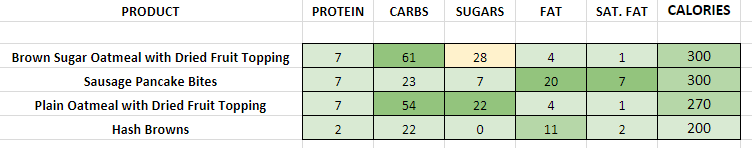
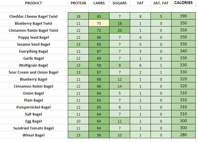
Below you will find a set of tables that include every menu item available at this restaurant. I find that certain restaurants freely publish PDF’s but then make them hard to read to avoid showing you what’s in their food.
I’ve taken the liberty of creating a Colour Coded System based on The Recommended Daily Allowance of macro-nutrients, seen below.
The Key
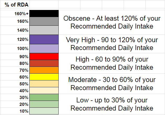
The more of your daily intake a food contains, the higher up the colour chart.
The % of your RDA is based off someone eating 2205 calories per day. These numbers only serve as guidelines.
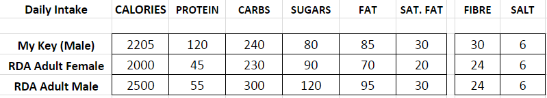
N.B. I believe men should have a higher protein intake and lower carbohydrate intake than the guidelines
These colour charts have three functions:
- You can see at a glance how healthy a restaurant is.
- You can spot high sugar/fat categories such as the sugar in drinks menu’s
- When selecting an individual item e.g. a sandwich, you can see how it compares to other choices.
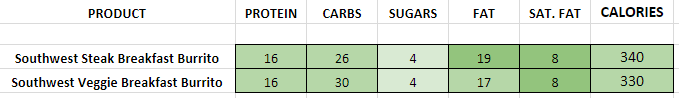
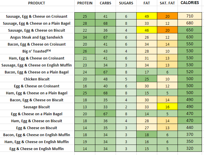
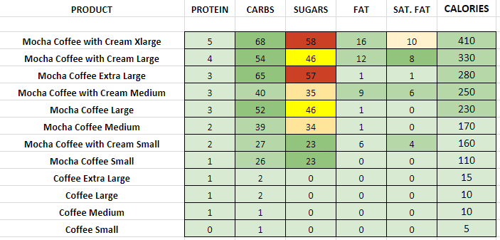
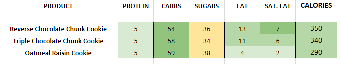

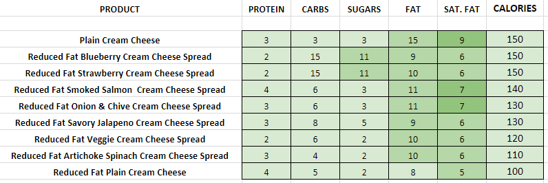
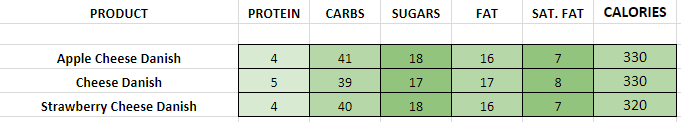
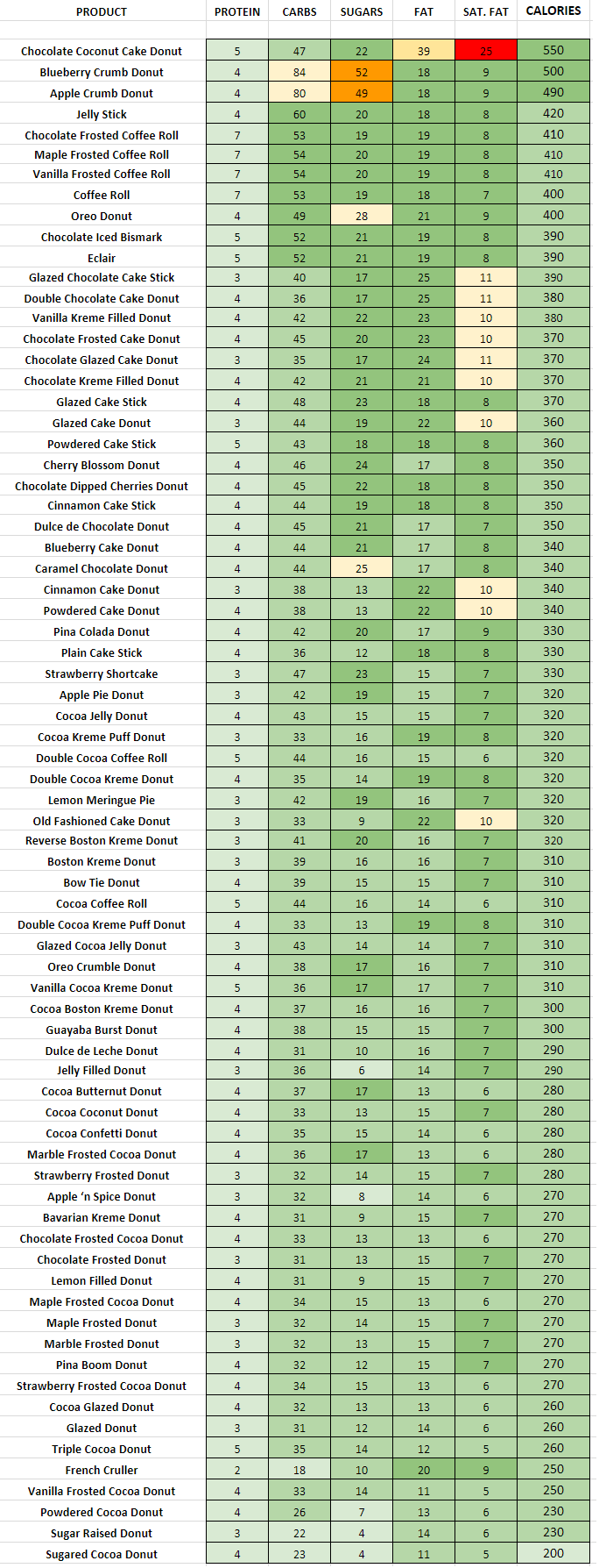
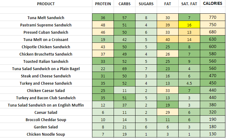
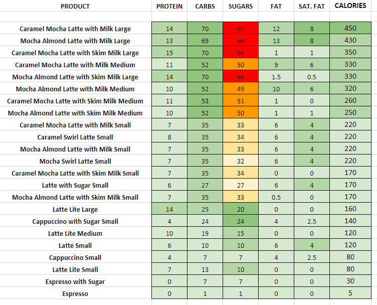
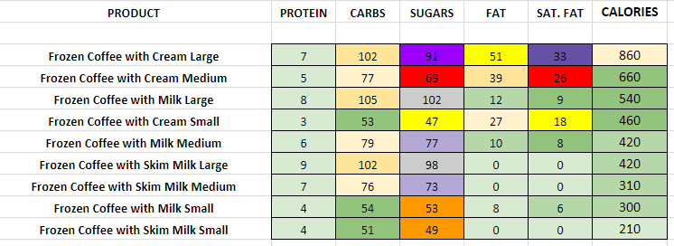
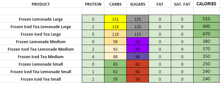
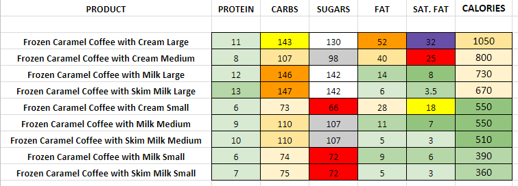
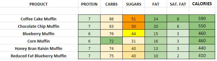
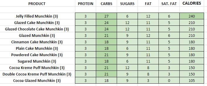
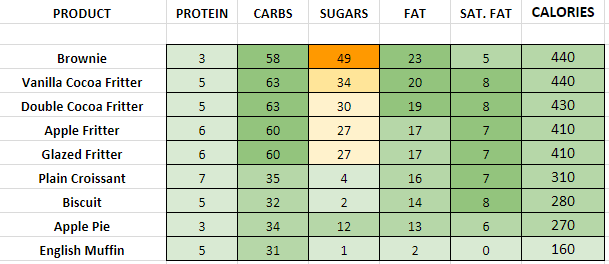
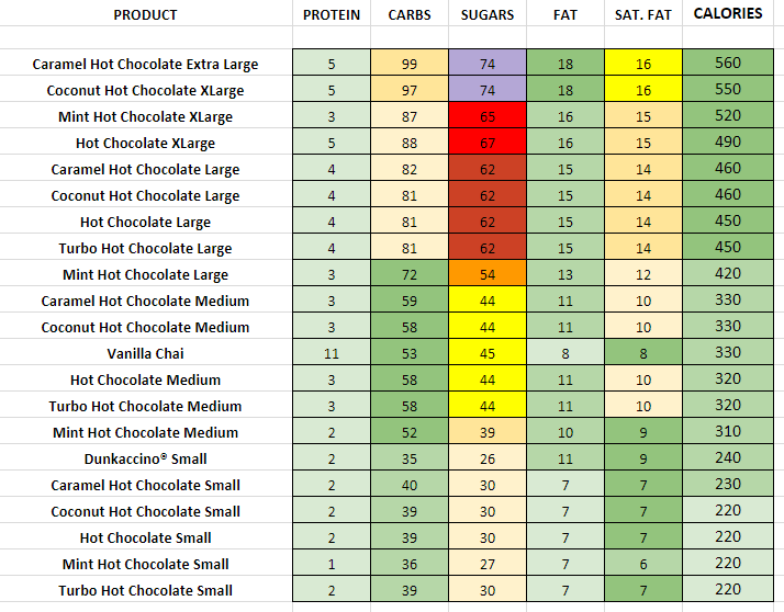
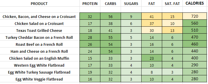
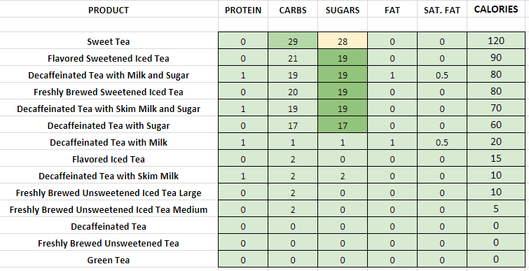
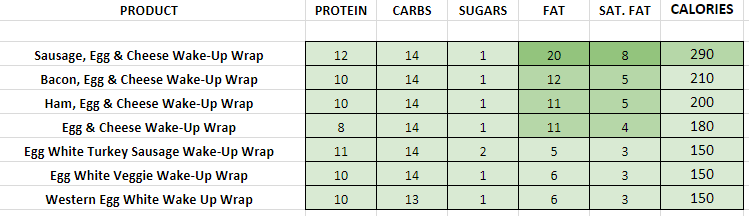
Correct as of June 2012